A clear starting point
Streaming, VOD and cinema apps
Five-panel streaming template
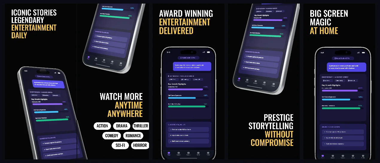
Pitch-black five-panel streaming set: 155 px uppercase Oswald headlines with #F6C844 tail lines, one tilted 3D phone bridging panels 1–2, a seven-pill white genre grid on panel 2 and headline bands that alternate top and bottom.
Free plan ($0 forever) · Pro $69/yr · No credit card required
Every background fill, gradient stop and headline color remains editable in Studio.
Practical walkthrough
Drop one capture per phone slot; panels 1 and 2 share a single device layer, so one screen crosses the seam when the strip is displayed connected.
Keep each headline to three lines at 155 px — the boxes are 502 to 617 px tall, and a fourth line drops the type size to fit.
Relabel the seven genre pills on panel 2 (75 px Oswald, #050505 on white) or delete the row for a cleaner panel, then export five 1320 × 2868 PNGs.
Streaming, VOD and cinema apps
Catalogues whose genre breadth is the pitch
Listings that want condensed uppercase type instead of sentence-case headlines
Five panels, every one a 1320 × 2868 px canvas on the same solid #050505 field with no gradient or texture. The type does the branding: Oswald Medium at 155 px, uppercase, 1.02 leading, white, with the closing line of each headline switched to #F6C844 gold by an emphasis run rather than a second text layer. Panels 1 and 2 are a connected pair — the same device layer is placed at 66% across panel 1 and −34% across panel 2 at 127% scale and −14° rotation, so one tilted iPhone 18 Pro Max crosses the seam between them; panel 2 adds a second phone at 16° and 124% scale in its top third. Headline bands alternate: panels 1, 3 and 5 set the type at 109 to 120 px from the top edge in boxes 1,082 px wide, while panels 2 and 4 drop it to 1,649 px and 2,036 px so the hardware sits above the promise. Panel 2 also carries seven white rounded chips, 138 px tall with a half-height radius, lettered in 75 px Oswald at #050505 and staggered 3–2–2 across rows at 2,185, 2,363 and 2,541 px — the one place the set names genres instead of promising them. Panels 3 and 5 use a single upright phone at 80% and 82% scale centred near the middle of the canvas, and panel 4 tilts its phone +14° at 126% with the headline underneath. Headlines, the gold emphasis runs, both shared devices, all seven chips and their labels stay editable layers. It belongs to the dark-mode App Store screenshot templates family; the obsidian collector vault uses the same #050505 field for resale product photography instead of streaming, and the dark-mode template family also keeps a lighter slate-grey direction that leaves poster art inside each panel.
Questions
Yes. Upload your own PNG, JPEG or WebP app captures when creating the project and every device slot updates automatically.
Yes. The template opens as structured text, image, device and vector layers—never a flattened bitmap.
Yes. Connect https://appscreendesign.com/mcp in Claude, ChatGPT, Cursor or Codex and use the copyable prompt on this page.
Start with a composition. Keep every detail editable.