A clear starting point
Navigation, map and city-guide apps
Five-panel navigation template
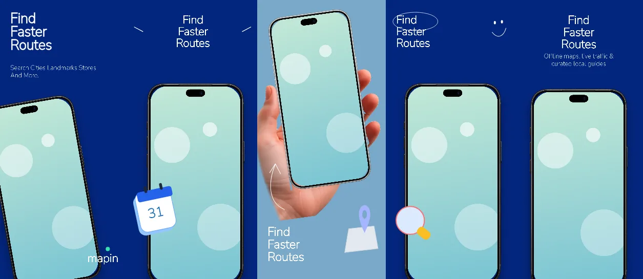
Deep #03267E navy on four panels with one #7AA9C8 sky-blue break on panel 3, 143-155 px white Nunito Sans headlines, a 138 px #1D70B8 day counter and a -10 degree handheld iPhone.
Free plan ($0 forever) · Pro $69/yr · No credit card required
Every background fill, gradient stop and headline color remains editable in Studio.
Practical walkthrough
Upload map, itinerary, route and search captures; panel 3 is the sky-blue handheld frame, so put the capture that needs the most context there.
Keep the panel-1 headline to three lines at 143 px in the 1,109 x 502 px box, and treat the 66 px subtitle under it as one short line of search terms.
Recolor #03267E and #7AA9C8 together - the sky panel is the only contrast break - then export five 1320 x 2868 PNGs.
Navigation, map and city-guide apps
Trip planning with day-by-day itineraries
Listings that need one light panel inside a dark set
Four of the five 1320 x 2868 px panels are solid #03267E navy; panel 3 switches to #7AA9C8 sky blue, so the strip has exactly one light frame in the middle. Panel 1 sets a 143 px white headline in a 1,109 x 502 px box at 120 px, a 66 px #E2E8F0 subtitle in a 1,109 x 178 px box under it, a black iPhone 18 Pro Max at 72% scale and -10 degrees and a 120 px wordmark at the bottom right. Panel 2 centres a 155 px headline in a 1,109 x 359 px box above a 78% upright phone and adds a 138 px #1D70B8 day counter in a 290 px box at 2,031 px. Panel 3 uses the sky canvas for a handheld silver frame at 134% scale and -8 degrees in the top third, with a 155 px headline in a 739 x 387 px box underneath. Panels 4 and 5 return to navy with 155 px headlines - panel 4 left-aligned over the 78% phone, panel 5 centred with a 66 px subtitle and the same phone at 68% of panel height. Headlines, both subtitles, the day counter, the wordmark and every device layer stay editable. It belongs to the travel app screenshot templates family; the Cerulean ocean stay planner also switches to a light canvas mid-strip but does it for booking, not for maps.
Questions
Yes. Upload your own PNG, JPEG or WebP app captures when creating the project and every device slot updates automatically.
Yes. The template opens as structured text, image, device and vector layers—never a flattened bitmap.
Yes. Connect https://appscreendesign.com/mcp in Claude, ChatGPT, Cursor or Codex and use the copyable prompt on this page.
Start with a composition. Keep every detail editable.