A clear starting point
Skincare, beauty and cosmetics shops
Five-panel beauty template
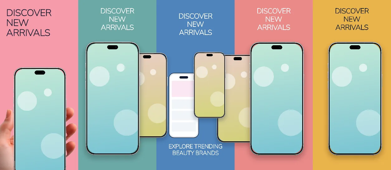
One solid pastel per panel from #F69AAA through #6CA9A6, #4F84BC and #EA8A89 to #EAB34B, uppercase 141–161 px headlines and phones that step from a handheld hero to three-device collages.
Free plan ($0 forever) · Pro $69/yr · No credit card required
Every background fill, gradient stop and headline color remains editable in Studio.
Practical walkthrough
Put the hero product shot in the panel-1 handheld frame at 140% scale — it is the only handheld frame in the set.
Keep the uppercase headline to two lines at 141 px on panels 2–5; they share a 1,162 × 416 px box.
Recolor each panel background individually — the five pastels are separate layers — then export five 1320 × 2868 PNGs.
Skincare, beauty and cosmetics shops
Listings that want a five-colour carousel instead of one palette
Product grids that need multi-phone collages
Every panel is a 1320 × 2868 px canvas with its own solid colour: #F69AAA, #6CA9A6, #4F84BC, #EA8A89 and #EAB34B in order, which makes the strip read as a colour carousel rather than one continuous scene. Panel 1 places an iPhone 18 Pro Max handheld frame at 140% scale, 44% across, under a 161 px uppercase #0F172A headline in a 1,109 × 688 px box. Panel 2 pairs a 72% upright phone with a smaller 54% one at 88% across under a 141 px white headline in a 1,162 × 416 px box. Panel 3 spreads three devices at 54%, 56% and 42% scale across the edges, with a 141 px headline at 215 px and a 98 px uppercase subheadline in a 1,003 px box at 2,423 px. Panels 4 and 5 each use two or one upright phone at 56–72% scale with a 141 px headline at 129 px; panel 5 switches the headline ink back to #0F172A on #EAB34B. Headlines, the subheadline and every device placement stay editable. It belongs to the e-commerce & lifestyle screenshot templates family; the Amethyst express grocery set proves the opposite direction — one flat colour and one repeated device for a speed-led app.
Questions
Yes. Upload your own PNG, JPEG or WebP app captures when creating the project and every device slot updates automatically.
Yes. The template opens as structured text, image, device and vector layers—never a flattened bitmap.
Yes. Connect https://appscreendesign.com/mcp in Claude, ChatGPT, Cursor or Codex and use the copyable prompt on this page.
Start with a composition. Keep every detail editable.