A clear starting point
Grocery, delivery and quick-commerce apps
Five-panel grocery template
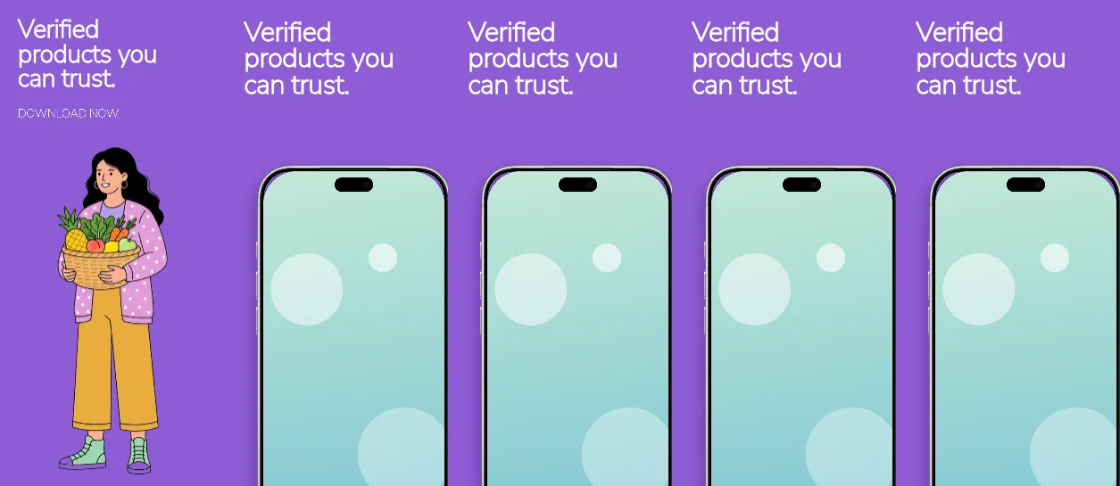
One flat #8E5CD6 purple across all five panels, a 149 px cover headline with a download line, then 161 px left-aligned headlines above the same upright silver iPhone on panels 2–5.
Free plan ($0 forever) · Pro $69/yr · No credit card required
Every background fill, gradient stop and headline color remains editable in Studio.
Practical walkthrough
Put your basket, category, tracking and account captures in panels 2–5; the same device layer sits at 90% scale and 58% across in all four, so the set stays consistent.
Keep each headline to four short lines in the 1,109 × 688 px box — the emphasis word is an italic run inside the same text layer, not a second block.
Swap the cover headline and its DOWNLOAD NOW line, recolor #8E5CD6, then export five 1320 × 2868 PNGs.
Grocery, delivery and quick-commerce apps
Listings that want one brand colour and no photography
Products whose value is speed rather than browsing
Five 1320 × 2868 px panels on the same solid #8E5CD6 purple, with no gradient and no background artwork, so the UI in the phone is the only illustration. Panel 1 is text only: a 149 px white headline in a 1,109 × 502 px box starting 103 px from the top and a 69 px call-to-action line in a 950 px box under it. Panels 2–5 reuse one silver iPhone 18 Pro Max at 90% scale, 58% across and 75.7% down, above a 161 px left-aligned headline in a 1,109 × 688 px box at 115 px from the top; each headline carries one emphasis word in an italic run rather than a separate layer. That shared geometry means a single capture set drops into four different states — delivery, doorstep, pickup and companion — without repositioning the device. Headlines, the emphasis runs, the CTA and the device layer stay editable. It belongs to the e-commerce & lifestyle screenshot templates family; the Periwinkle decor boutique keeps one palette but builds it as a gradient with a handheld panel instead of a flat field.
Questions
Yes. Upload your own PNG, JPEG or WebP app captures when creating the project and every device slot updates automatically.
Yes. The template opens as structured text, image, device and vector layers—never a flattened bitmap.
Yes. Connect https://appscreendesign.com/mcp in Claude, ChatGPT, Cursor or Codex and use the copyable prompt on this page.
Start with a composition. Keep every detail editable.