A clear starting point
Vacation rental, homestay and deals apps
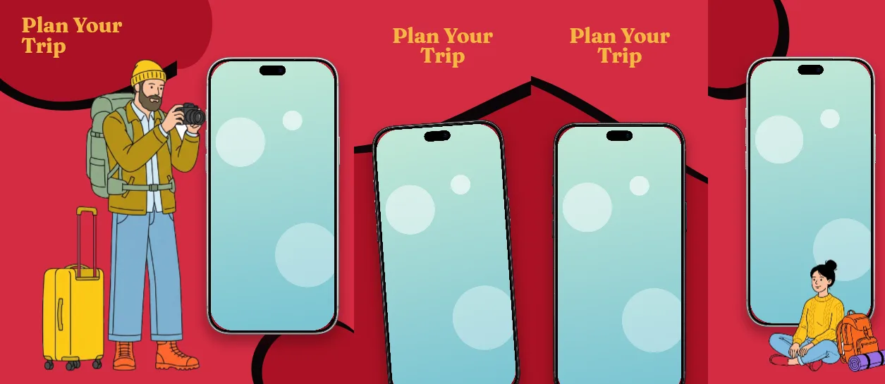
Five-panel vacation deals template
Deep red cover #A91124 leading into #D42C42 body panels, 155 px Fraunces headlines in #F5B841 gold, and upright silver or black iPhones at 76–78% scale on every body panel.
Free plan ($0 forever) · Pro $69/yr · No credit card required
Every background fill, gradient stop and headline color remains editable in Studio.
Practical walkthrough
Put your best listing photo or search result in the panel-3 phone first; its 1,109 × 387 px headline above the device is the widest type box in the set.
Keep the cover headline to two lines at 155 px in the 1,030 × 416 px box — the cover has no device, so the type carries the whole frame.
Replace the demo captions with the actual offer wording, then export five 1320 × 2868 PNGs at the 1320 × 2868 canvas.
Vacation rental, homestay and deals apps
Listings that want a warm red palette with gold type
Short deadlines and price-led offers
Five 1320 × 2868 px panels in two reds: a #A91124 cover and #D42C42 for panels 2–5, with every headline set in Fraunces 700 at 155 px in the #F5B841 gold that gives the template its name. The cover carries no device at all — only a 1,030 × 416 px headline box at 158 px from the left and 120 px from the top, so the opening frame is type and colour. Panels 3 and 4 repeat the same structure: a 1,109 × 387 px headline box at 195 px from the top, then a silver (panel 3, −4°) or black (panel 4, 0°) iPhone 18 Pro Max at 78% scale around 68% of panel height. Panel 2 skips the headline and hands the frame to a single silver phone at 78% scale, 51% of panel height. Panel 5 closes with the same gold-on-red treatment and a 76% silver phone at 50%. Headlines and all device layers stay editable; the two reds are separate background layers, so the cover stays darker than the body. It belongs to the travel app screenshot templates family; the Cerulean ocean stay planner uses the same five-panel length with a serif blue palette and a mid-strip colour switch instead.
Questions
Yes. Upload your own PNG, JPEG or WebP app captures when creating the project and every device slot updates automatically.
Yes. The template opens as structured text, image, device and vector layers—never a flattened bitmap.
Yes. Connect https://appscreendesign.com/mcp in Claude, ChatGPT, Cursor or Codex and use the copyable prompt on this page.
Start with a composition. Keep every detail editable.