Landscape-aware layouts
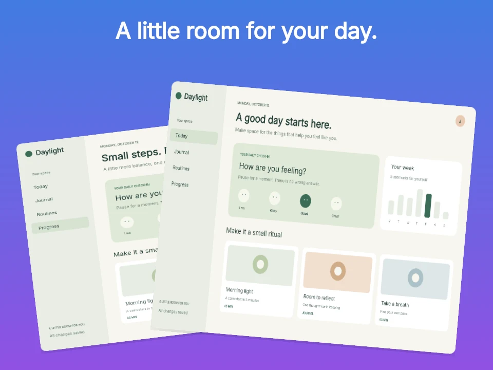
Start with compositions designed for a wide iPad canvas instead of adapting an iPhone poster by eye.

Device workflow
Choose an iPad family, upload the right captures and use a layout built for the wider canvas. Keep device, copy and background controls in one editor.
Free during early access · No card required
Practical walkthrough
Tablet captures often show navigation and working content side by side. Preserve that relationship instead of zooming in until the sidebar disappears.
Portrait and landscape are separate design targets. Choose the orientation you intend to submit before selecting a matching template.
Use the iPad version of the interface. Stretching a phone capture into a tablet shape makes text and controls look wrong.
Review sidebars, toolbars and bottom actions after changing the crop. Keep the caption secondary when the workspace is the feature.
Start with compositions designed for a wide iPad canvas instead of adapting an iPhone poster by eye.
Upload original captures per screen and replace them without losing the surrounding design.
See every panel in order and inspect native dimensions before downloading.
Tablet screenshots need more breathing room, stronger grouping and a clear reading path across the wider frame. iPad templates treat that space as part of the story.
Keep related device families in a project and edit the active family without confusing its captures or template choices with iPhone screens.
Questions
No. Start with your real app screenshots, choose a composition, then change copy, colors, device frames and artwork in the browser editor.
Yes. Upload the original PNG or JPEG captures. Your screenshots replace the illustrative content in a template while the layout stays editable.
Yes. Connect a compatible MCP client after sign in. Your agent can create projects, edit scenes, preview results and export them. Attachment uploads require a client that can provide a supported file reference.
Start with a composition. Keep every detail editable.