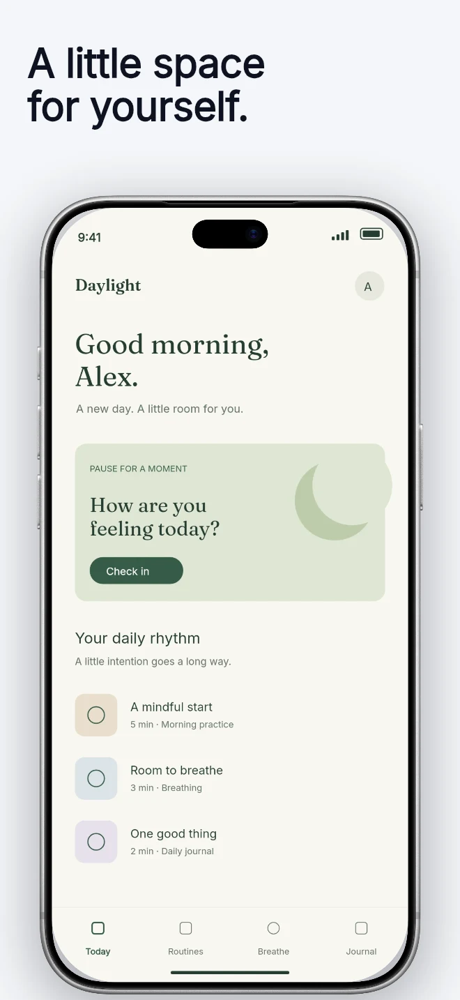
A light background, dark headline and generous device area. Let a colorful interface carry the visual energy.
Explore template
Template direction
Minimal design still needs structure. Start with a quiet layout that gives the app capture space, then tune type, contrast and spacing in the editor.
Free during early access · No card required
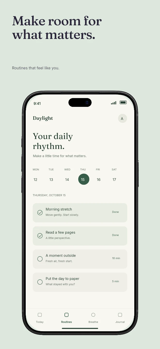
Explore real compositions
Practical walkthrough
With fewer decorative layers, the headline, capture and spacing do more work. Choose a consistent visual rule for the entire sequence.
Keep line length and alignment deliberate across the set. Rewrite a long caption before reducing its size too far.
Try a neutral canvas with the actual app interface. Add another background color only when it improves separation or reading order.
Inspect the first and last panels side by side. Consistent device scale and safe spacing usually matter more than an extra badge.
Use a small palette and clear type hierarchy so the product screen carries the attention.
Edit each headline and supporting line directly against the real capture.
Reuse the visual direction across screens while changing the message for each feature.
The strongest quiet screenshot sets make one claim at a time. Templates give that claim enough spacing and keep the supporting interface legible.
Check text against the actual background and preview the complete set together. A calm first screen can still need a stronger accent on a later feature screen.
Questions
No. Start with your real app screenshots, choose a composition, then change copy, colors, device frames and artwork in the browser editor.
Yes. Upload the original PNG or JPEG captures. Your screenshots replace the illustrative content in a template while the layout stays editable.
Yes. Connect a compatible MCP client after sign in. Your agent can create projects, edit scenes, preview results and export them. Attachment uploads require a client that can provide a supported file reference.
Start with a composition. Keep every detail editable.